|
Most digital
cameras have a black and white shooting mode. However, this usually does
nothing more than create identical Red, Green, and Blue channels in the
final picture file. Black and white film aficionado generally find the
results from digital cameras lacking, though--you can do much better in
Photoshop.
You could,
for instance, convert the mode from RGBColor to Grayscale.
When you use this technique, Photoshop applies a set of defaults to the
transition. I find that these tend to be a little too low in contrast
for my taste. (See the right-hand column for examples.)
Or you could
simply choose Desaturate and take all the color out of the image.
This technique also tends to produce an image that still needs work, though.
You'll find it difficult to achieve rich, deep blacks and a long range
of gray detail.
Another choice
is to convert the image to Lab Color mode, and then delete the
A and B channels (the two channels that contain the color information).
Note that when you delete the first color channel, the channels get renamed--it
still should be obvious which one is the Lightness channel, though (the
remaining color channel will be quite dark).
But the best
way to achieve outstanding black and white photos is to use Photoshop's
channel mixer abilities to act as a digital set of black and white filters.
Before we get to the instructions, let's look at the three channels you'll
be working with:
 

From left
to right, the Red channel, Green channel, and Blue channel. It's worth
looking at the three individually, as it gives you some idea of how you
might want to mix them. For example, we need the Red channel to define
Steve's skin tones, the Blue channel to define the rock behind Steve.
In this particular picture, the Green channel doesn't help us much, so
the balance between the Red and Blue channels will be the ones to watch
closely.
The steps
for using the Channel Mixer go like this:
- Take
your pictures in color, as usual. Be especially careful not to let
highlight detail get overexposed. This is even more important for images
that get converted to black and white, as you'll want significant detail
in the light grays of your final image.
- Start
up Photoshop and open the image you want to convert.
Choose Open from the File menu and navigate to your image.
- Convert
the image to black and white.
Select Channel Mixer from the Adjust submenu on the Image
menu. In the mixer, click on the Monochrome box at the bottom,
then adjust the Red, Green, and Blue channels.
The balance of the three channels is your "digital filter"
tray, so don't be afraid to adjust each channel individually until you
find the right balance for your image. I often find that I want to be
a little more aggressive on the Red channel, a little less aggressive
on the Green channel. (Note that with high ISO values or long exposures,
you may have to deal with noise in one or more of the channels before
making your conversion.)
- Finish
your adjustments. Normally, I’d try the Auto Contrast
or Auto Levels controls first, just to see what effect they produce
(don't scoff, in black and white these automated controls work a bit
better than they do in color). If these controls didn’t achieve
the rich range of grays I was looking for, then I’d use Curves
(all on the Adjust submenu of the Image menu).
 |
On
the left is my first pass using Channel Mixer. I've intentionally
reduced the contrast somewhat (I tend to like to apply Curves to balance
against what my printer does in black and white). On the right is
my final pass using the Color Mixer (I also moved the white and black
points slightly). One thing you should notice is the additional contrast
I picked up in the rock. The photo on the right looks "sharper"
than the one of the left, but believe it or not, I've made no
changes other than channel balance and setting white and black points.
(I sharpened the color original before making the black and white
conversions, but I did not apply any additional sharpening after the
conversions.) |
 |
|
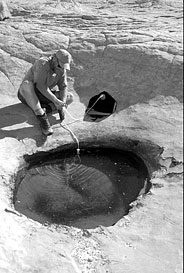
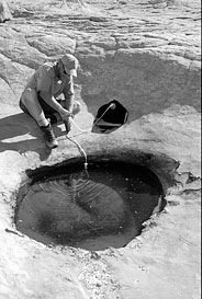
Here's our
original color image. (Steve Howe, BACKPACKER Rocky Mountain editor getting
our evening's water supply in Capital Reef National Park).
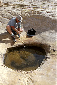
Photoshop's
Grayscale conversion. Note the lack of contrast in the rocks behind Steve.
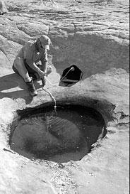
Desaturation
produces a bit more contrast, and gives us a better starting point than
Grayscale.
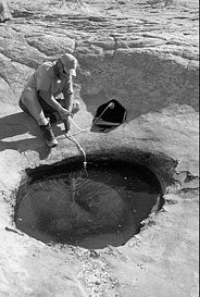
I like the
Lab Color conversion because it usually produces images that are easier
to work with. Compare the shadow areas on Steve's shirt in this version
compared to the others. Skin tones tend to look lighter and more natural,
as well.
|